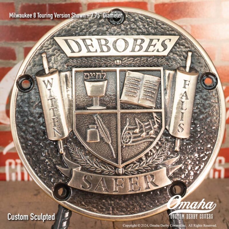
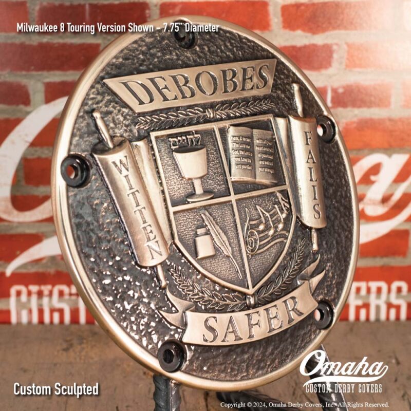
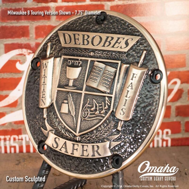
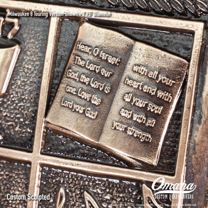
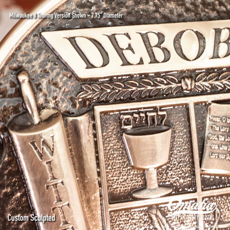
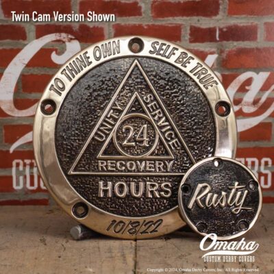
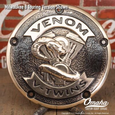
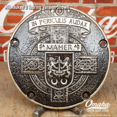
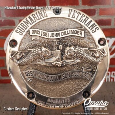
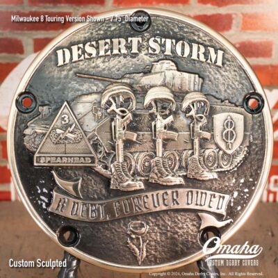
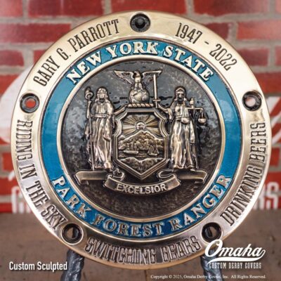
This piece presented some real challenges. When the client and I were first working through the design, the idea was that the writing on the Torah would just be squiggly lines. But the more I thought about it, the more I thought we would have room to fit a short verse into that space, and have it come out readable.
Having put myself into that particular corner, I didn’t have any choice but to make it work. That was tough, since the lettering is so tiny, I did not have room to do any post-casting cleanup. My smallest finishing tool is 0.5mm in diameter, and even that would be too big.
So it was one shot to get it right! I made the wax multiple times, inspecting the lettering for the slightest defect. After six tries, I got one that was perfectly clean. Then it was just a matter of extra careful shell work, and crossing my fingers during the actual casting.
I was delighted by how well it came out. It is one of those details that you will never see when the derby cover is installed on the bike, but if you look close, the attention to detail will show through. Sometimes obsession pays off!